Hey Frightners,
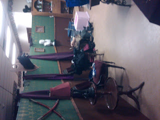
So tonight is flashback part two of Grimlock Manor. I just showed our Main Foyer wall panels two posts below and will start with a few pictures of them set up at the haunt but tonight I wanted to post a few pictures of our "Study Room" panels as we called them.
Now these shots show these panels in two different settings and set ups in both day time and night time so you can see all the details. The Study Room panels probably took the least time to create. The top was painted green and bottom brown with a wood base board divider. We used a stamp to create our fo-wallpaper pattern using a gold paint on top of the green. It was quick and easy and I think it gave it a nice effect as apposed to using wallpaper again.
The Study Room followed the Main Foyer in our haunt and had a creepy vibe about it. We played old muisc that skipped and had people dancing in the room. You had to walk between our actors to get through it. They didn't really try to scare you as much as they try to freak you out and make you uncomfortable and they help slow and control the pace of everyone coming through our haunt. It was a nice transition room that helped set up the big scares that were set up in the room ahead.
The next two rooms I will feature is our "White Room" or "Lucillas Room" and our Lab!
If you have any questions about the panel creations or about any of the props you see in the room please post a comment and I will do my best to answer. I hope everyone is enjoying the "Old School"pictures of Grimlock Manors beginnings, I know I am! I look forward to bringing you more this week.
Frightguy~
Monday, May 30, 2011
Subscribe to:
Post Comments (Atom)


0 comments:
Post a Comment